Traditional Sci-Fi web design is tedious and difficult to scale, requiring extra elements or images for each clip, all rotated and carefully positioned to cover corners, often required to match against solid color backgrounds and solid color borders to stay hidden. augmented-ui removes all these limitations. No scripts to install, no extra elements to rotate, no images, and no need to redo everything if the size, content, or context changes. You can even use multiple gradients and gifs in the borders and backgrounds if you wanted to. All this with a handful of custom CSS properties. (+ ~93% global compatibility!)
Version 2 is a complete rewrite, built on (and because of) the discovery of the CSS Space Toggle trick.
As a result, augmented-ui v2 doesn't just augment your element, now it augments CSS itself.
Like standard CSS properties, the core of augmented-ui expands your design options with over 150 --custom-properties. Accessing these core properties just requires adding the data-augmented-ui attribute to your element: <div data-augmented-ui></div>
It may appear to do nothing on its own but now you can use --css-variable toggles to shape your element in over 250,000 unique ways, then use --css-variable properties to customize the size and alignment of every bend in an infinite number of ways, and use --even-more-options for an augmented inlay and augmented border that follow the shape and can be painted with the full power of the multi-layered CSS <background> value type!
augmented-ui's simplicity in previous versions could be credited to how the augs (individual shapes assigned to positions along the perimeter) were applied just by putting their name in the element attribute's value: <div data-augmented-ui="tl-clip br-clip both"></div>
This OOCSS-like pattern has returned as a separate layer of mixins.
Mixins are the fastest way to get started, especially for anyone already familiar with augmented-ui. They are essentially a higher-level api that set the low-level core toggles (and some properties) for you. Since there are a handful of technical nuances in core to be aware of, and since Space Toggle is a new technique, using the mixin layer lets you completely avoid both of these concerns until you're interested in diving deeper!
Example of the mixin approach with some customization:
  .pitch-mixin {
    --aug-tr: 25px;
    --aug-b-extend1: 50%;

    --aug-border-all: 7px;
    --aug-border-bg: radial-gradient(
      at top, gold 25%, transparent 50%),
      url("/img/what_a_save.gif") 50% 50% / 100% 100%;

    --aug-inlay-all: 4px;
    --aug-inlay-bg: radial-gradient(gold, black);
    --aug-inlay-opacity: 0.5;
  }
Same example using the core approach with an additional :hover state defined in the CSS itself - a feature that would require JS if you were using mixins. (note: using core directly also helps keep your design decisions primarily in the CSS!)
<div class="pitch-core"
data-augmented-ui>
  .pitch-core {
    --aug-border: initial;
    --aug-border-all: 7px;
    --aug-border-bg: radial-gradient(
      at top, gold 25%, transparent 50%),
      url("/img/what_a_save.gif")
      50% 50% / 100% 100%;

    --aug-inlay: initial;
    --aug-inlay-all: 4px;
    --aug-inlay-bg: radial-gradient(
      at center center, gold, black);
    --aug-inlay-opacity: 0.5;

    --aug-clip-b1: initial;
    --aug-clip-b2: initial;
    --aug-b-extend1: 50%;
  }
  .pitch-core:not(:hover) {
    --aug-clip-tl1: initial;
    --aug-tl-inset1: 30px;
    --aug-tl1-alt-join-in: initial;

    --aug-scoop-tr1: initial;
    --aug-tr1: 25px;
  }
  .pitch-core:hover {
    --aug-clip-t1: initial;
    --aug-clip-t2: initial;
    --aug-clip-r1: initial;
    --aug-clip-r2: initial;
    --aug-clip-l1: initial;
    --aug-clip-l2: initial;
    --aug-t-extend1: 50%;
    --aug-r-extend1: 50%;
    --aug-l-extend1: 50%;
  }
Since core can change augs based on any CSS selector logic now, there's no more need for js libraries packed with more edge cases than use cases like aug-attr-spliced.js! Hooray!
Not just Sci-Fi anymore! With the new options available in v2, augmented-ui may even be suitable for some of your medieval needs. Here is a small set of examples with codepen links to go hands-on!
TODO: examples!
Though not yet documented, you'll find these examples in a separate "medieval-mixins.css" file, included on install, and ready to use.
92.96%Global User Support
(according to browser usage percentages from caniuse.com in mid August 2020)
Browser
IE
Edge
Firefox
Chrome
Safari
Opera
iOS Safari
Opera Mini
Android Browser
Opera Mobile
Chrome for Android
Firefox for Android
UC Browser
Samsung Internet
Unsupported
1.65%
0.91%
0.36%
0.55%
0.16%
0.24%
0.56%
0.91%
0.17%
0.00%
0.00%
0.30%
Supported Since Version
79+
54+
51+
9.1+
38+
11.2+
81+
46+
84
68
12+
5+
Supported Global Usage
1.89%
3.70%
30.66%
3.70%
1.07%
11.20%
0.00%
0.01%
35.38%
0.26%
1.47%
3.62%
augmented-ui v2 has no built in fallbacks (except for -webkit-clip-path support). If you need to support older browsers, you can use this CSS @supports statement to overwrite your site's older styles for browsers that support augmented-ui.
            @supports (--foo: , 0 0) and ((clip-path: polygon(0 0, 100% 0, 50% 50%)) or (-webkit-clip-path: polygon(0 0, 100% 0, 50% 50%))) {

              /* augmented-ui styles here */

            }
The most important design/styling considerations you should be aware of when also supporting older browsers are:
If you use an augmented inlay as a background, be mindful of text readability when augmented-ui is unsupported.
If you put text behind an augmented element, it may be obstructed when augmented-ui isn't available since the element won't be clipped.
augmented elements create their own stacking context so you may need to force the new stacking context manually in old browsers if you run into z-index differences in your designs.
Install with NPM: $ npm install augmented-ui
Then include the /node_modules/augmented-ui/augmented-ui.min.css file once, before any stylesheets that use it.
OR
Use your favorite NPM CDN and include it on your page before other stylesheets for small projects. Like so: <link rel="stylesheet" type="text/css" href="https://unpkg.com/augmented-ui@2/augmented-ui.min.css">
Note: Many CSS linters and minifiers, including the most popular today, have parsing bugs that will block your project build, produce invalid CSS when minifying, or incorrectly call parts of augmented-ui's CSS a syntax error. If your project is built with Create React App, for example, you'll need to copy the augmented-ui CSS file into your app's public folder and manually include it in the index.html file to avoid the automatic minification. Read more here: Ecosystem Compatibility
Every user-facing css variable is prefixed with --aug- so it doesn't step on the toes of other libraries you may be using.
Every internal css variable starts with --aug_ for a similar reason. (These should not be overwritten directly.)
There is 1 primary html attribute: data-augmented-ui
plus 3 lesser used html attributes: data-augmented-ui-reset, data-augmented-ui-border, data-augmented-ui-inlay
The value for data-augmented-ui is where all mixins are added (if you use them). Its individual mixin names are not namespaced since they only appear inside this specific attribute's value.
There are no reserved class names, ids, or elements.
The CSS Spec is in progress of changing to remove this newly adopted necessity and make the previous 4 years of behavior the new spec.
* There is an edge case where you may not need the reset layer if the augmented children use a subset of the augs (or all the same augs), in the same positions, as the augmented ancestor. It is still recommended to use the reset layer for consistency though, at least until the spec changes.
☢
✋
⛉
⚑
For example, this figure is an augmented <ul> with augmented <li> direct descendants. Both the parent and child use clip augs in tl1, tr1, br1, and bl1 positions without the children using additional augs that the parent didn't, so the edge case is satisfied.
Technical nuance: This edge case result is the same in either Invalid-at-Computed-Value-Time implementation because both the parent and child would resolve specific internal variables of augmented-ui (since they're derived from the same toggles being flipped to `initial`) to the same simple values (like '0px' or ' '), AND they don't do further computation themselves. Therefore when the child inherits the parent's resolved value, it's the same answer the child would have resolved to (more efficiently) if the previous 4 years of browser behavior was still implemented. A rep from W3C and from Mozilla agree with updating the spec and reverting the change, Safari is open to the change as well, a Chromium member is holding it up for not-so-altruistic reasons though since they made the call to change it a few months ago without realizing or measuring the damage it could cause. People are complex though, so please do not add negativity to the discussion even though it's a bit frustrating. When your position's autonomy and authority imply you have to make the right decisions robotically, any indication that you didn't would cause most people anxiety. Beyond that, these things are questioned in public forum, which would cause anyone even more anxiety when requesting you change your decisions - almost worse when there's a pile of evidence showing it was a bad call. It's not an easy position to be in, everyone reacts differently, so please allow it to play out, and please keep any support for the change positive without dogpiling. I'm sure it'll land where it needs to, even if it's delayed unnecessarily for now.
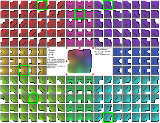
A border in augmented-ui is the ::after pseudo element with a background applied, clipped to remove the center. A border may be delegated to a child element instead, allowing it to be painted with anything you can render in dom. The border's background is only applied when CSS feature detection knows the center can be clipped away to avoid obstructing visibility of content in older browsers.
border
inlay
An inlay in augmented-ui is the ::before pseudo element with a background applied, clipped a distance from the border or outer edge. An inlay may be delegated to a child element instead, allowing it to be anything you can render in dom.
Both the border and inlay follow a degradation of the equipped aug path to maintain a constant distance from the outer shape.
Any element, with any content, can be used as the delegate border if the parent enables it. All augs and settings are determined by properties of the parent.
Any element, with any content, can be used as the delegate inlay if the parent enables it. All augs and settings are determined by properties of the parent.
Size of the border on all sides. This property is the least specific and is overwritten by all other border size options no matter what order they appear in.
Distance the inlay is inset from the border (or outer edge if there is no border) on all sides. This property is the least specific and is overwritten by all other inlay distance options no matter what order they appear in.
mixins are equipped to an element by placing their name in the value of the data-augmented-ui attribute: <div data-augmented-ui="tl-clip-x br-clip b-rect border"></div>
There are 8 mixin regions: tl, t, tr, r, br, b, bl, l
These correspond to the corners and edges of the augmented element. (ex: br = bottom right, t = top)
Most mixins specify one or two augs for a single region along with corresponding properties to customize the look.
Additionally, there are a few mixins you can add to the data-augmented-ui attribute to enable the augmented border and/or inlay: border, inlay, both
Similar to standard CSS properties like top/left/right/bottom that only do something after position is set, augmented-ui's border and inlay properties won't do anything without first initializing the corresponding feature with one of these mixins (or flipping the core toggles directly).
Each corner region, top left (tl), top right (tr), bottom right (br), and bottom left (bl) has 35 mixins to choose from. Each of them initialize one or two augs within the region and customize additional core region properties for you.
The first part of the mixin name is the region, the rest determines the shape applied to that region. For example these are the same mixin placed in different corner regions:
tl-2-clip-x
tr-2-clip-x
br-2-clip-x
bl-2-clip-x
Here is the complete list of all 35 mixins available for each corner region:
Each edge region, top (t), right (r), bottom (b), and left (l) has 15 mixins to choose from. Each of them initialize two augs within the region and customize additional core region properties for you.
14 of them are available for every edge. This set is the only exception where top/bottom and left/right don't have the x/y variant:
t-round-x
b-round-x
r-round-y
l-round-y
Here are the remaining 14 mixins available for each edge region:
Each of the 8 mixin regions have a property to scale the mixin: --aug-tl,
--aug-t,
--aug-tr,
--aug-r,
--aug-br,
--aug-b,
--aug-bl,
--aug-l
They all default to 15px (when a mixin is in the region) and have the same CSS Value Type: <length> (Typically px and does not support %)
These properties do not exist in core, they are part of the mixin layer. They are a shortcut to set multiple core properties of the corresponding region to the same value (or a multiple of that value). You can override any of the default mixin proportions by setting the core properties directly.
Bonus: Using mixins as a starting point and overriding some of these values with core is a great way to learn everything available as needed! Feel free to reach out on Twitter @James0x57 with any questions!
I've also included a handful of special mixins that configure all the regions to make specific shapes that are common in movie and game UI. If there are any specific shapes you'd like to see, please feel free to reach out on Twitter! Even if it doesn't make it into the library, I'd be happy to help.
<div data-augmented-ui="all-hex border">
Do not size with standard CSS properties, instead use a <length> value in either: --aug-all-width or --aug-all-height (not both)
This allows it to maintane its aspect ratio. Default height is 32px. ! Inlay not supported.
<div data-augmented-ui="all-hex-alt border">
Do not size with standard CSS properties, instead use a <length> value in either: --aug-all-width or --aug-all-height (not both)
This allows it to maintane its aspect ratio. Default width is 32px. ! Inlay not supported.
<div data-augmented-ui="all-triangle-up border">
Do not size with standard CSS properties, instead use a <length> value in either: --aug-all-width or --aug-all-height (not both)
This allows it to maintane its aspect ratio. Default width is 32px. ! Inlay not supported.
Do not size with standard CSS properties, instead use a <length> value in either: --aug-all-width or --aug-all-height (not both)
This allows it to maintane its aspect ratio. Default width is 32px. ! Inlay not supported.
Do not size with standard CSS properties, instead use a <length> value in either: --aug-all-width or --aug-all-height (not both)
This allows it to maintane its aspect ratio. Default height is 32px. ! Inlay not supported.
Do not size with standard CSS properties, instead use a <length> value in either: --aug-all-width or --aug-all-height (not both)
This allows it to maintane its aspect ratio. Default height is 32px. ! Inlay not supported.
<div data-augmented-ui="all-hexangle-up border">
Do not size with standard CSS properties, instead use a <length> value in either: --aug-all-width or --aug-all-height (not both)
This allows it to maintane its aspect ratio. Default width is 32px. ! Inlay not supported.
Do not size with standard CSS properties, instead use a <length> value in either: --aug-all-width or --aug-all-height (not both)
This allows it to maintane its aspect ratio. Default width is 32px. ! Inlay not supported.
Do not size with standard CSS properties, instead use a <length> value in either: --aug-all-width or --aug-all-height (not both)
This allows it to maintane its aspect ratio. Default height is 32px. ! Inlay not supported.
Do not size with standard CSS properties, instead use a <length> value in either: --aug-all-width or --aug-all-height (not both)
This allows it to maintane its aspect ratio. Default height is 32px. ! Inlay not supported.
Using multiple gradients positioned in the background of an augmented border can produce results even more useful than the shape alone.
<div data-augmented-ui="all-hexangle-up border" class="reticle"></div>
                .reticle {

                  --aug-all-width: 150px;

                  --reticle-color: #00bfff;

                  --reticle-size: calc(var(--aug-all-width) * 0.25);

                  --aug-border-bg: radial-gradient(

                    circle at top center,

                    var(--reticle-color) var(--reticle-size),

                    transparent var(--reticle-size)

                  ), radial-gradient(

                    circle at bottom 13.92% right 6.89%,

                    var(--reticle-color) var(--reticle-size),

                    transparent var(--reticle-size)

                  ), radial-gradient(

                    circle at bottom 13.92% left 6.89%,

                    var(--reticle-color) var(--reticle-size),

                    transparent var(--reticle-size)

                  );

                }
Distance after the region's first aug, parallel to its starting edge, clockwise. Behaves as 0px unless both positions in the region have an aug equipped.
Distance before the region's second aug, parallel to its ending edge, clockwise. Behaves as 0px unless both positions in the region have an aug equipped.
Specifies the center placement of an edge region. By default this is a calculation centering it half way between the innermost points of the corner regions, along the same edge. Set it to 50% to center it in the middle of the element's edge without considering the corner regions.
Specifies an offset to the center placement of the edge region. On top/bottom a negative value shifts the whole edge region left, on right/left negative values shift the edge region up.
All 16 aug positions: tl1, tl2, t1, t2, tr1, tr2, r1, r2, br1, br2, b1, b2, bl1, bl2, l1, l2
Can be set to any of the 5 core augs: clip, round, scoop, rect, step
clip
--aug-clip-tr1: initial;
round
--aug-round-t1: initial;
scoop
--aug-scoop-br1: initial;
rect
--aug-rect-b1: initial;
step
--aug-step-l1: initial;
(only useful when used with region insets)
To initialize an aug for a position, use this CSS: --aug-[aug name]-[aug position]: initial; Ex: --aug-clip-tl1: initial;
If your css steps on itself and you need to turn off an aug somewhere (like for :last-child or any other selector logic), you can set the value to a single space: --aug-[aug name]-[aug position]: ; Ex: --aug-clip-tl1: ;
(note: there are DevTools bugs that may prevent you from setting a CSS Variable to space from the console. Chrome, Firefox)
The 2nd aug position in a region can only be used if the 1st one is also used.
Sets the height and width of the aug equipped to the position. If there is no aug in the position, it behaves as 0px. If there is an aug in the position, the default value is 15px. If a % is used, the aug will render in the same aspect ratio as the element. If the ratio isn't 1:1 and clip, scoop, or round is used, the border and inlay gap may appear pinched similar to the standard elliptical border-radius.
Sets the width of the aug equipped to the position. Defaults to the corresponding --aug-[aug position] value. If a % is used with clip, scoop, or round and results in a non-square render, the border and inlay gap may appear pinched, similar to the standard elliptical border-radius.
Sets the height of the aug equipped to the position. Defaults to the corresponding --aug-[aug position] value. If a % is used with clip, scoop, or round and results in a non-square render, the border and inlay gap may appear pinched, similar to the standard elliptical border-radius.
Most clip angles in sci-fi are 45deg, but if you'd like to render a clip aug with custom w:h ratios, these will un-pinch the border and inlay gap for any fixed angle you want. To calculate these values:
augmented-ui relies on dynamic and optional composition of standard comma-separated CSS properties. This requires a leading comma in a custom property + an empty fallback in var(). Here is a minimal example of how that works: https://jsbin.com/cemujarozo/1/edit?html,css,output
A common problem in CSS parsers is to erroneously give meaning to commas in custom properties, and then complain about having a leading comma. Even old versions of safari on iOS ran into this issue and they have since fixed it. Fortunately it can be safely feature detected to avoid problems in those versions of iOS: @supports (--foo: , 0 0)
Compatibility with Create React App
Create React App depends on PostCSS and cssnano. Both of these libraries have parsing bugs that block augmented-ui so you'll need to copy augmented-ui.min.css into the public folder and manually include it in the index.html file to avoid them until they're fixed.
SASS has multiple implementations/compilers, some have parsing bugs related to the leading comma in custom properties. The compiler used on sassmeister.com handles the leading comma correctly in custom properties (by ignoring it), but trips up when it's used in a supports statement @supports (--foo: , 0 0) If you run into trouble, include augmented-ui.min.css separately from your SASS ecosystem.
Other notes?
Please feel free to file an issue if you run into any trouble, I'll be glad to take a look and work on a path forward for you!
augmented-ui is open source and free to use in any project. NPM | GitHub | BSD 2-Clause License
Monetary support isn't necessary but it would be very very much appreciated. There were only a couple costs in development up to now, less than $250 total, but I have spent all of my savings working on mostly Open Source projects in the last two years and have nearly maxed my credit card paying rent the last 5 months. (I've finally secured a job, will start soon)
Above all else though, I just want help make awesome cyberpunk and sci-fi inspired UI as common on the web as it is in the games and movies.
If you use augmented-ui in your project, I would love to see it! I'm not much of a designer so I can't wait to see it in the hands of someone skilled!
Find me @James0x57 on twitter :)